|
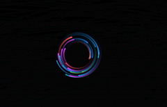
CSS3三角形不断放大特效 特效预览:  http://www.wd1x.com/css/canvas5.html html代码
<!DOCTYPE html>
<html lang="en">
<head>
<meta charset="UTF-8">
<title>CSS3三角形不断放大特效</title>
<link rel="stylesheet" href="css/style.css">
</head>
<body>
<div class="wrapper">
<svg class="triangle-canvas" viewBox="0 0 1000 1000" xmlns="http://www.w3.org/2000/svg">
<polygon class="triangle triangle-1" points="500,200 759,650 241,650" />
<polygon class="triangle triangle-2" points="500,200 759,650 241,650" />
<polygon class="triangle triangle-3" points="500,200 759,650 241,650" />
<polygon class="triangle triangle-4" points="500,200 759,650 241,650" />
<polygon class="triangle triangle-5" points="500,200 759,650 241,650" />
<polygon class="triangle triangle-6" points="500,200 759,650 241,650" />
<polygon class="triangle triangle-7" points="500,200 759,650 241,650" />
<polygon class="triangle triangle-8" points="500,200 759,650 241,650" />
<polygon class="triangle triangle-9" points="500,200 759,650 241,650" />
<polygon class="triangle triangle-10" points="500,200 759,650 241,650" />
<polygon class="triangle triangle-11" points="500,200 759,650 241,650" />
<polygon class="triangle triangle-12" points="500,200 759,650 241,650" />
<polygon class="triangle triangle-13" points="500,200 759,650 241,650" />
<polygon class="triangle triangle-14" points="500,200 759,650 241,650" />
<polygon class="triangle triangle-15" points="500,200 759,650 241,650" />
<polygon class="triangle triangle-16" points="500,200 759,650 241,650" />
<polygon class="triangle triangle-17" points="500,200 759,650 241,650" />
<polygon class="triangle triangle-18" points="500,200 759,650 241,650" />
<polygon class="triangle triangle-19" points="500,200 759,650 241,650" />
<polygon class="triangle triangle-20" points="500,200 759,650 241,650" />
</svg>
</div>
</body>
</html>
style.css代码:
html {
height: 100%;
}
body {
padding: 0;
margin: 0;
height: 100%;
background: #642B73;
/* fallback for old browsers */
/* Chrome 10-25, Safari 5.1-6 */
background: linear-gradient(to left, #C6426E, #642B73);
/* W3C, IE 10+/ Edge, Firefox 16+, Chrome 26+, Opera 12+, Safari 7+ */
}
.wrapper {
overflow: hidden;
position: absolute;
top: 0;
left: 0;
width: 100%;
height: 100%;
}
.triangle-canvas {
position: absolute;
left: 50%;
top: 50%;
width: 100%;
height: 100%;
-webkit-transform: translate(-50%, -50%);
transform: translate(-50%, -50%);
}
.triangle {
fill: none;
stroke: #fff;
stroke-width: 15;
-webkit-transform-origin: center center;
transform-origin: center center;
-webkit-animation: triangle-animation 10s linear infinite;
animation: triangle-animation 10s linear infinite;
}
.triangle-1 {
-webkit-animation-delay: 0s;
animation-delay: 0s;
}
.triangle-2 {
-webkit-animation-delay: -0.5s;
animation-delay: -0.5s;
}
.triangle-3 {
-webkit-animation-delay: -1s;
animation-delay: -1s;
}
.triangle-4 {
-webkit-animation-delay: -1.5s;
animation-delay: -1.5s;
}
.triangle-5 {
-webkit-animation-delay: -2s;
animation-delay: -2s;
}
.triangle-6 {
-webkit-animation-delay: -2.5s;
animation-delay: -2.5s;
}
.triangle-7 {
-webkit-animation-delay: -3s;
animation-delay: -3s;
}
.triangle-8 {
-webkit-animation-delay: -3.5s;
animation-delay: -3.5s;
}
.triangle-9 {
-webkit-animation-delay: -4s;
animation-delay: -4s;
}
.triangle-10 {
-webkit-animation-delay: -4.5s;
animation-delay: -4.5s;
}
.triangle-11 {
-webkit-animation-delay: -5s;
animation-delay: -5s;
}
.triangle-12 {
-webkit-animation-delay: -5.5s;
animation-delay: -5.5s;
}
.triangle-13 {
-webkit-animation-delay: -6s;
animation-delay: -6s;
}
.triangle-14 {
-webkit-animation-delay: -6.5s;
animation-delay: -6.5s;
}
.triangle-15 {
-webkit-animation-delay: -7s;
animation-delay: -7s;
}
.triangle-16 {
-webkit-animation-delay: -7.5s;
animation-delay: -7.5s;
}
.triangle-17 {
-webkit-animation-delay: -8s;
animation-delay: -8s;
}
.triangle-18 {
-webkit-animation-delay: -8.5s;
animation-delay: -8.5s;
}
.triangle-19 {
-webkit-animation-delay: -9s;
animation-delay: -9s;
}
.triangle-20 {
-webkit-animation-delay: -9.5s;
animation-delay: -9.5s;
}
@-webkit-keyframes triangle-animation {
0% {
-webkit-transform: scale(0) rotate(0deg);
transform: scale(0) rotate(0deg);
opacity: 1;
}
100% {
-webkit-transform: scale(3) rotate(45deg);
transform: scale(3) rotate(45deg);
opacity: 0;
}
}
@keyframes triangle-animation {
0% {
-webkit-transform: scale(0) rotate(0deg);
transform: scale(0) rotate(0deg);
opacity: 1;
}
100% {
-webkit-transform: scale(3) rotate(45deg);
transform: scale(3) rotate(45deg);
opacity: 0;
}
}
|